In this post, I want to introduce another web design approach that can be used in place of Responsive Design, Adaptive Design.
Introduction
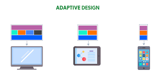
Adaptive web design (AWD) is another web design approach that uses multiple fixed-layout versions of a webpage to fit different devices, rather than a single, fluid layout. When a user visits a site, the server detects their screen size and delivers the most appropriate pre-designed layout, providing a highly optimized, yet static, user experience for that specific device category.
The website adapts by selecting the most appropriate layout from a set of options, rather than fluidly resizing and rearranging content like responsive design.
How adaptive design works
- Pre-defined layouts: Developers create multiple, distinct layouts for a site based on common screen widths, or "breakpoints." A standard might include versions for mobile (e.g., 320px, 480px), tablets (e.g., 760px), and desktops (e.g., 960px, 1200px, 1600px).
- Device detection: When a user visits the site, the server or browser detects the device type, screen size, and other characteristics.
- Optimal layout served: Based on that detection, the system delivers the best-fitting, pre-built layout to the user. If a user resizes their browser window on a desktop, the layout will not fluidly adjust until it hits the next pre-defined breakpoint.
- Progressive enhancement: Adaptive design is often associated with the concept of "progressive enhancement," where developers start by building a robust version for small, less capable screens and then add enhanced features and a more complex layout for larger, more powerful devices.
Key characteristics
- Dedicated Experience: AWD provides a tailored experience for each specific device, offering more control over content and layout for different platforms.
- Pre-defined Screen Sizes: The design is based on a limited set of common screen widths, not a continuous range of sizes.
- Static Content: Once loaded, the layout for a particular device doesn't change or reflow as it might in a responsive design when the browser window is resized.
When to use it
- Optimized for Specific Devices: It is ideal for situations where the goal is to create a highly polished experience for distinct device categories, such as web applications with separate iOS, Android, and desktop versions.
- Retrofitting Existing Sites: Adaptive design can be a good strategy for improving the mobile experience of an existing desktop site by allowing control over design for new viewports.
How they relate
Adaptive and Responsive Design are both solutions to the same modern web challenge: accommodating the wide variety of devices and screen sizes. They are not mutually exclusive, and many developers use a hybrid approach that combines the best aspects of both. For example, a developer might use responsive techniques for general page layout but use adaptive techniques to swap out key images or navigation menus at major screen-size breakpoints.
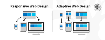
Responsive Design VS Adaptive Design
While often used interchangeably, both responsive and adaptive designsaim to make a website accessible and user-friendly across multiple devices but differ in their approach:
- Responsive design: Uses a fluid, flexible layout that continuously adjusts to the browser space. It relies on a single codebase that dynamically reflows content.
- Adaptive design: Uses a set of static layouts designed for specific screen sizes or breakpoints. The website detects the user's device and loads the most appropriate predefined layout.
Conclusion
Adaptive Web Design offers a powerful alternative or complement to Responsive Design, addressing the modern challenge of diverse screen sizes by using multiple, distinct, fixed layouts. Rather than fluidly adjusting, the website detects the user's device and serves the most optimal, pre-designed experience from a set of static layouts.
This approach provides dedicated control over the user experience for specific device categories and is often associated with progressive enhancement.
While both adaptive and responsive designs aim for cross-device accessibility, they differ in their method—static, multiple layouts versus a single, fluid layout. Ultimately, developers often employ a hybrid strategy, blending the best features of both to create a robust and highly optimized web presence for all users.
Thank you for reading and have a wonderful rest of your day.